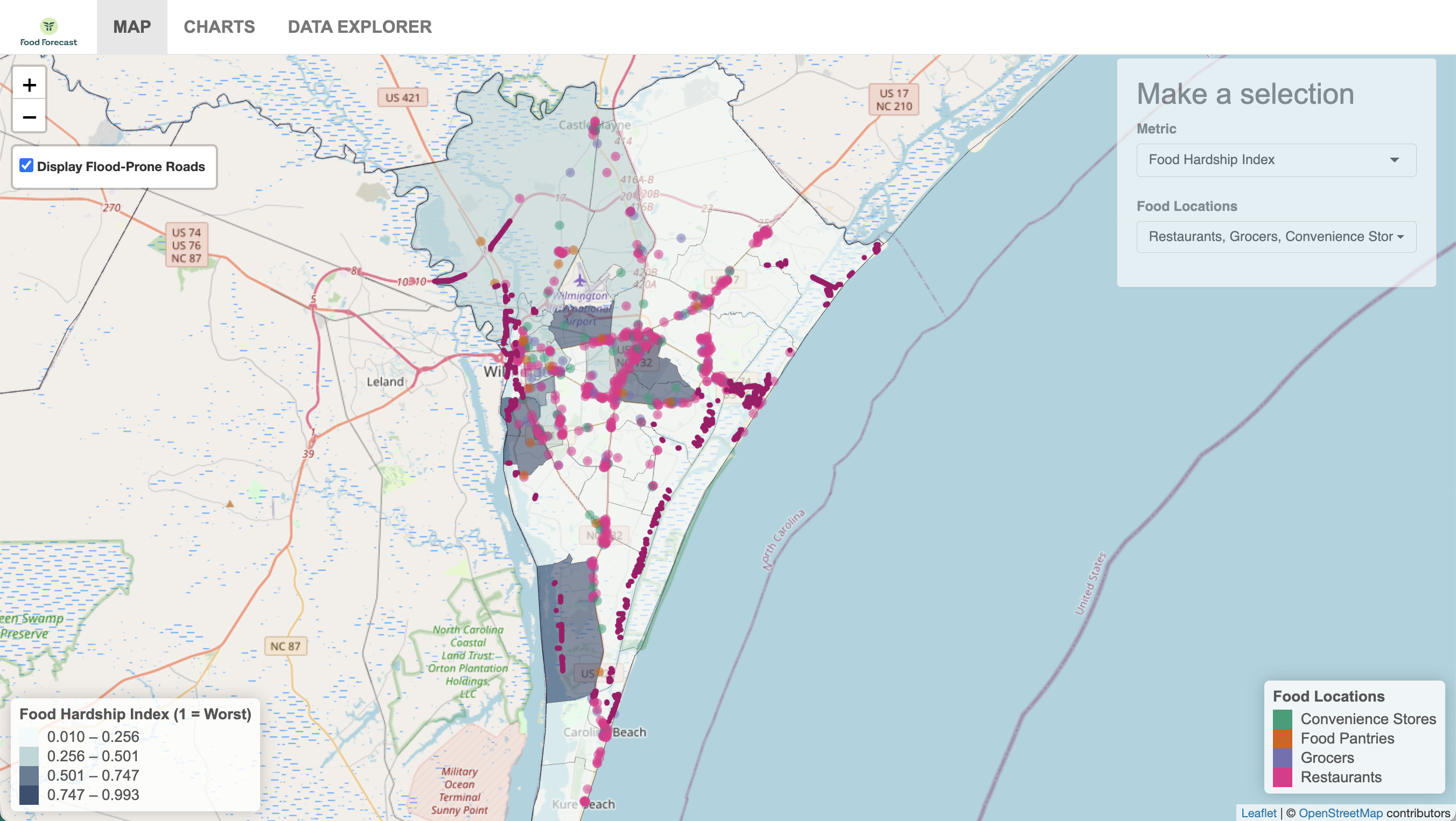
An interactive map low-fidelity prototype visualizes hazard/natural, built, and social environmental data This map provides end users with information to identify likely flooding locations, where population is located with specific characteristics that might highlight specific needs, and food sources (e.g., grocery store, food pantry). Harmonizing multiple data sources allows emergency responders to better plan, distribute, and stockpile food supplies ahead of a disaster. End users are able to toggle on and off different layers and add filters to the map. This is an improvement upon current data and measures which are located across a dozen different data sources to provide synthesized data in a single platform. In Phase 2, the last 50 years of storms will be hindcast to visualize roadways more and less frequently flooded historically.
The editable map is similar to the map described above but enables the user to add their own place-based information to the map. For example, an end user can “drop pins” to add locations where staff convene, supplies are pre-positioned, or feeding operations are set up. The user can then employ embedded spatial analysis tools to compute descriptive metrics for those locations, such as how many people live within a 2-mile catchment of a feeding operation, or the average distance between a neighborhood and the closest feeding operation. This is an improvement upon current maps because it allows the user to drop pins with information like in Google Maps with the advantage of having a suite of disaster food and nutrition security information integrated alongside analytic tools. According to the stakeholder and end-user interviews conducted in Phase 1, the interactive map feature is of high value for emergency managers and community leaders as it combines the benefit of accessing a tool with a variety of harmonized datasets ready to be used with the customizability that this group of professionals often already uses in times of crisis (e.g., flood maps, google maps, population data from the US census, etc.).

A scorecard prototype was designed to provide end-users with information about the individual data points driving the community food insecurity measure. For example, the scorecard would tell the end user what a community food insecurity measure of 34% is driven by through providing individual data points in the computation of that summary score. The above figure shows the scorecard with illustrative indicators of interest for a specific county or census tract as well as simple trend visualizations. End users can use the scorecard to compare the status between different counties or census tracts as well as with the entire state. The scorecard can be used to determine areas of geographic focus to improve disaster food security. This scorecard provides more detailed information on community level food insecurity within a hazard context than the current metrics of vulnerability in a disaster context (e.g., SVI) by including indicators specific to food security. It also improves upon community food security metrics (e.g., USDA food desert measure now called the Food Research Atlas) by including more comprehensive indicators contributing to food security (i.e., dietary needs of the population, food assistance, etc.). The Food Research Atlas primarily measures food insecurity based on access to a vehicle and the distance between communities and the nearest food retail outlet using Euclidean distance (“as the crow files”). The current version of the scorecard is in the prototype stage, meaning that the data extraction and visualization has not yet been automated.

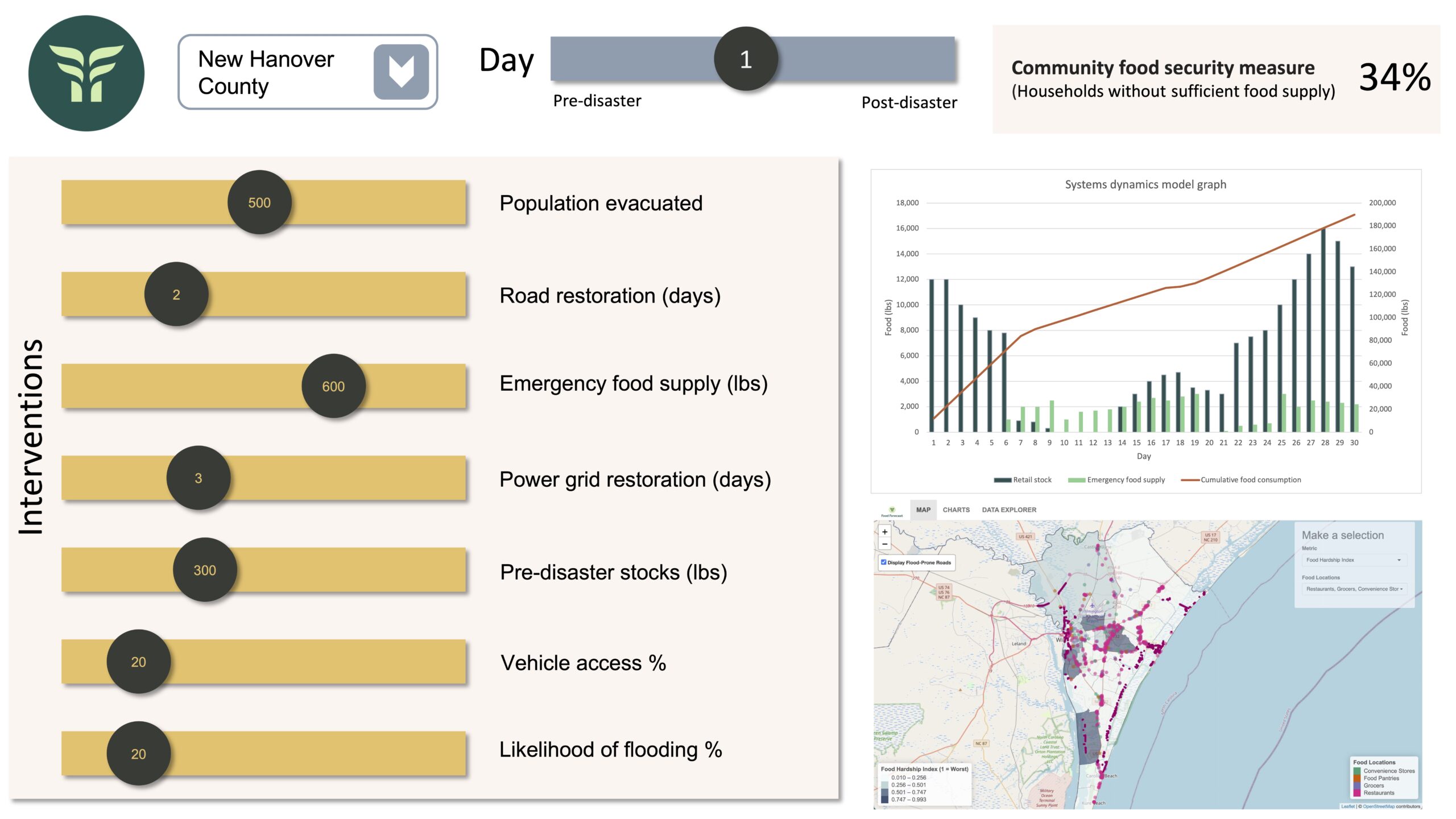
Simulation tool: this tool takes the “community food security” measure a step further and allows the user to simulate interventions that may have a positive effect on food security in different census tracts. On the dashboard, users can select a census tract and a specific time horizon (e.g., beginning 7 days before and ending 28 days after the disaster), and move levers for interventions. For example, a user could choose to increase pre-disaster stockpiles and/or decrease the time until road or power restoration is completed. The dashboard will convey three possible outputs: a) the community food security measure, describing the cumulative meal shortage per capita for the simulated time horizon, b) a time graph showing the behavior of key model stocks over time (e.g., population, food supply line/incoming food, etc.), and c) a map enabling comparison to neighboring jurisdictions.